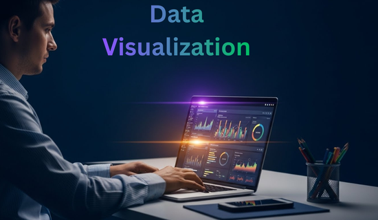
Data Visualization Made Simple: Beginner’s Guide
Data visualization is one of the most valuable skills in today’s digital world.
In simple words, it helps people understand data quickly and clearly.
Every day, huge amounts of data are created.
However, raw numbers alone are hard to read and even harder to understand.
That is exactly why data visualization is so important.
By converting data into charts and graphs, complex information becomes easier to grasp.
As a result, people can make smarter decisions in less time.
If you are looking for a beginner-friendly guide to data visualization, this article is for you.
Most importantly, you do not need advanced math or coding skills to get started.
In the following sections, you will learn data visualization step by step with clear examples and practical tips.
What Is Data Visualization? (Simple Definition)
Data visualization is the practice of presenting data in a visual format.
Usually, this includes charts, graphs, maps, and dashboards.
Instead of reading long tables, visuals highlight patterns instantly.
Therefore, insights become easier to spot.
For example, a sales table may look confusing at first glance.
In contrast, a bar chart immediately shows which product performs best.
This matters because the human brain processes visuals much faster than text.
Because of that, visual Data improves understanding and communication.

Why Data Visualization Is Important Today
Today, data is growing at an incredible speed.
However, numbers alone do not provide real meaning.
Without clarity, data loses its value.
That is why data visualization plays such a critical role.
By presenting information visually, understanding becomes faster.
As a result, people can act with more confidence and accuracy.
Key Benefits of Data Visualization
To begin with, data visualization simplifies complex information.
In addition, it reveals hidden trends and patterns.
Moreover, visuals support faster and more accurate decisions.
At the same time, they improve communication across teams.
Most importantly, visual data reduces errors and confusion.
Because of these benefits, organizations rely heavily on dashboards.
Consequently, data visualization skills are now in high demand.
Real-World Examples of Data Visualization
In daily life, data visualization appears more often than we realize.
For example, weather apps show temperature changes using line charts.
Likewise, fitness apps display progress through simple graphs.
Meanwhile, finance apps present spending habits with pie charts.
In, Business Environment, dashboards track revenue and growth.
Similarly, schools use charts to analyze student performance.
Clearly, data visualization is part of modern life everywhere.
Common Types of Data Visualization Charts
Selecting the right chart is extremely important.
Otherwise, even accurate data can become confusing.
Below are some of the most common chart types.
Bar Charts
Bar charts compare values across different categories.
They are especially useful for sales data and survey results.
Because of their structure, comparisons become clear at a glance.
Line Charts
Line charts show changes over time.
They are ideal for tracking growth, traffic, or trends.
As a result, long-term patterns are easier to identify.
Pie Charts
Pie charts display parts of a whole.
They work best when only a few categories are involved.
For this reason, percentages become simple to understand.
Scatter Plots
Scatter plots show relationships between variables.
They are commonly used in research and data science.
Therefore, correlations and outliers become easier to spot.

Data Visualization in Data Science
In data science, visualization is a core step.
Before building models, data scientists explore data visually.
Through charts, they detect trends, missing values, and errors.
Additionally, visuals help explain results to non-technical audiences.
Because of this, data visualization connects technical analysis with decision-making.
In short, good visuals turn data into actionable insights.
Popular Data Visualization Tools for Beginners
Fortunately, many beginner-friendly tools are available today.
Excel
First of all, Excel is easy to learn and widely used.
It supports basic charts and quick analysis.
Python Visualization
Later, Python offers libraries like Matplotlib and Seaborn.
These tools are powerful and common in data science.
Tableau & Power BI
Meanwhile, these tools focus on interactive dashboards.
They are popular in business and analytics roles.
Each tool serves a different purpose.
Therefore, beginners should start simple and grow gradually.

Data Visualization Best Practices
Effective visuals follow clear rules.
Without structure, charts can confuse users.
Best Practices to Follow
- Keep designs simple
- Use clear labels
- Limit unnecessary colors
- Choose the correct chart type
- Focus on one message at a time
💡 Tip:
Always choose clarity over decoration.
A simple chart is often more powerful than a flashy one.
How Beginners Can Start with Data Visualization
Getting started is easier than it seems.
First, learn basic chart types.
Next, practice with small datasets.
After that, explore tools like Excel or Google Sheets.
Later on, move to Python or BI tools.
Above all, stay consistent with practice.
Because skill improves through repetition, patience matters more than speed.
Common Myths About Data Visualization
Myth 1: Only experts can learn data visualization
Reality: Anyone can learn it step by step.
Myth 2: Coding is mandatory
Reality: Many tools work without code.
Myth 3: More charts mean better analysis
Reality: Clear visuals are better than many visuals.
Career Benefits of Learning Data Visualization
Learning data visualization opens many career opportunities.
Popular Career Roles
- Data Analyst
- Business Analyst
- Data Scientist
- Marketing Analyst
- Product Analyst
Even non-technical professionals benefit from visual data skills.
Therefore, data visualization is a smart long-term investment.

FAQs – Data Visualization (AEO Optimized)
What is data visualization in simple words?
It means showing data with charts and graphs to make it easy to understand.
Why is data visualization important?
It helps people understand data faster and make better decisions.
Is data visualization hard for beginners?
No. With simple tools and practice, beginners can learn it easily.
Do I need coding skills?
No. Coding is optional and useful later, not required at the start.
Which tool is best for beginners?
Excel and Google Sheets are the best starting tools.
Is data visualization part of data science?
Yes. It is a key step in data science workflows.
How long does it take to learn data visualization?
Basic skills take weeks. Advanced skills take months.
Is data visualization a good career skill?
Yes. Demand is high across many industries.
🚀 Call to Action
Now that you understand data visualization, it is time to take action.
👉 Bookmark this guide
👉 Share it with fellow learners
👉 Explore more AI, data science, and visualization tutorials on minsaai.com
💡 Small steps today can lead to strong data skills tomorrow.
Final Thoughts
At first, data visualization may feel challenging.
However, once the basics are clear, learning becomes easier.
With simple tools and regular practice, progress stays steady.
Over time, data visualization can become one of your strongest skills.


Post Comment
You must be logged in to post a comment.